PORTFOLIO REDESIGN · 2025
TheSamulation
I rebuilt my portfolio from scratch as a dual-view experience — a 2D editorial site and an interactive 3D workstation, running from one React codebase.
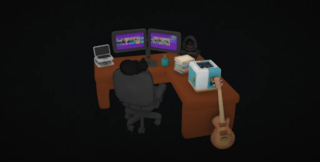 3D Workstation
At a glance
- What
- This site — an explorable 3D desk with real work behind every object
- My role
- Design, build, and the 3D scene
- Outcome
- You're inside it right now
- Stack
- React · Vite · Spline · Tailwind
2
Parallel Experiences
5+
Case Studies
6
Interactive Objects
Zero
Templates Used
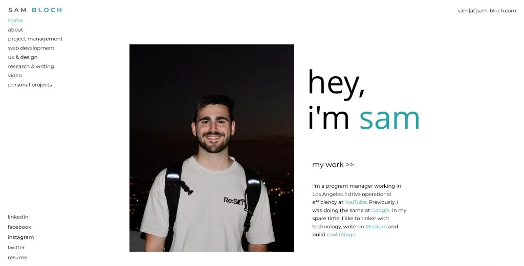
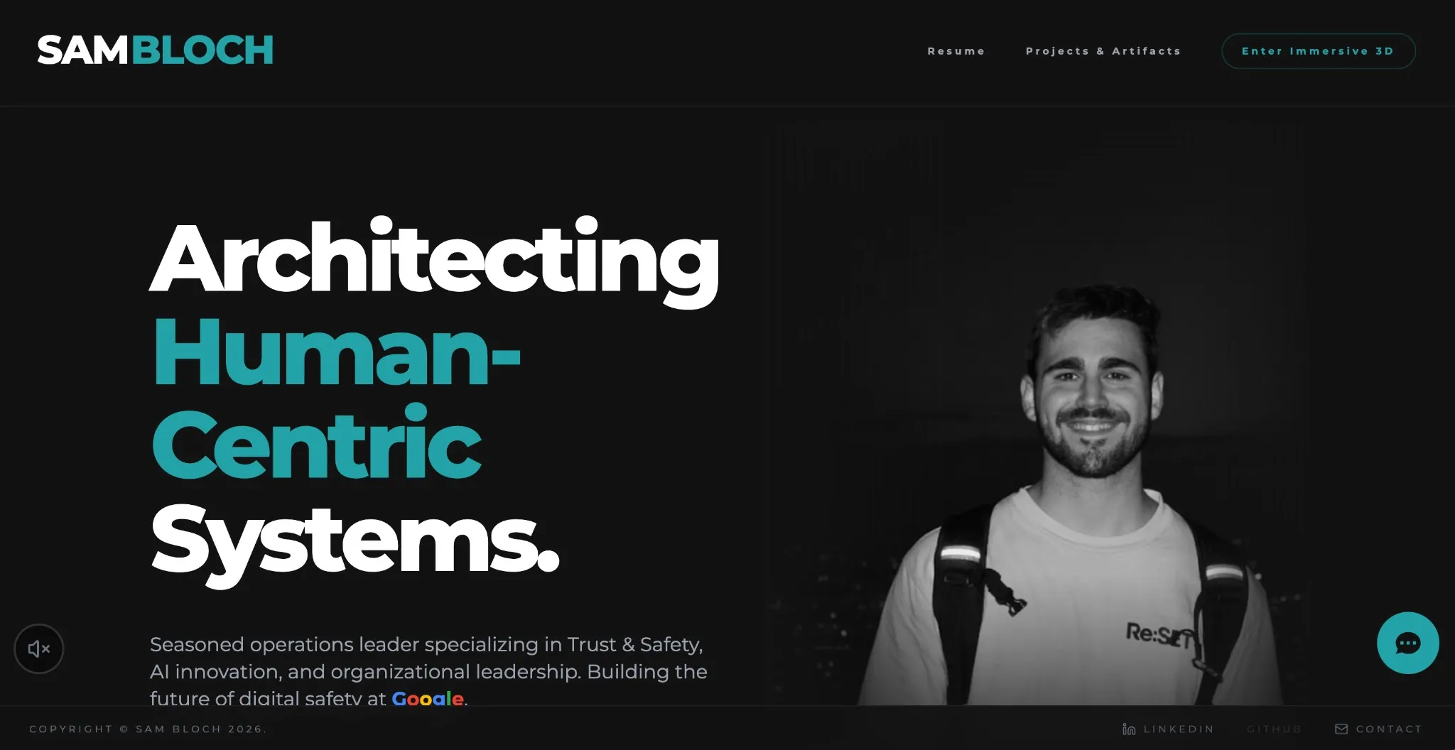
My old site was fine. That was the problem.
I graduated from Michigan State, put up a portfolio, and didn't touch it for years. White background, teal accent, eight categories in the nav. It said "here's who I am" but never showed what I could actually build. That bugged me more the longer I left it.
Interactive
Drag to compare
I wrote four rules before touching any code.
Actually Use AI
Not as a gimmick. I wanted AI woven into the build process itself — 3D asset generation, code iteration, the whole pipeline.
Level Up Technically
Go from flat HTML/CSS to a real React architecture. Routing, state management, components that compose properly.
Build in 3D
I'd been playing with Spline and wanted to make something spatial — an environment people would actually explore, not just scroll past.
Prove the Thesis
If I claim I think in systems, the portfolio itself should prove it. Not describe it. Prove it.
The 2D editorial experience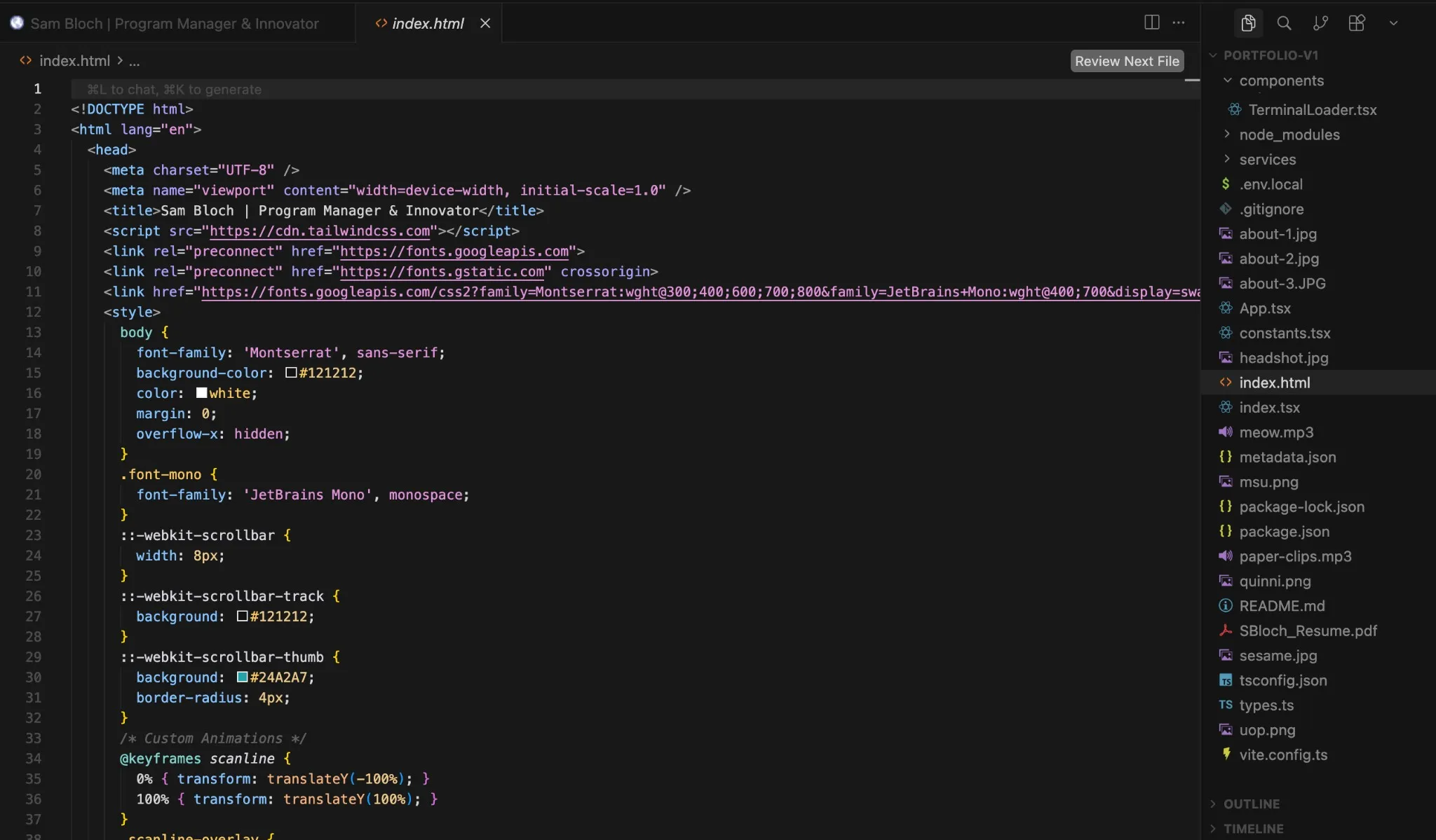 Component architecture in TypeScript
One codebase, two ways in.
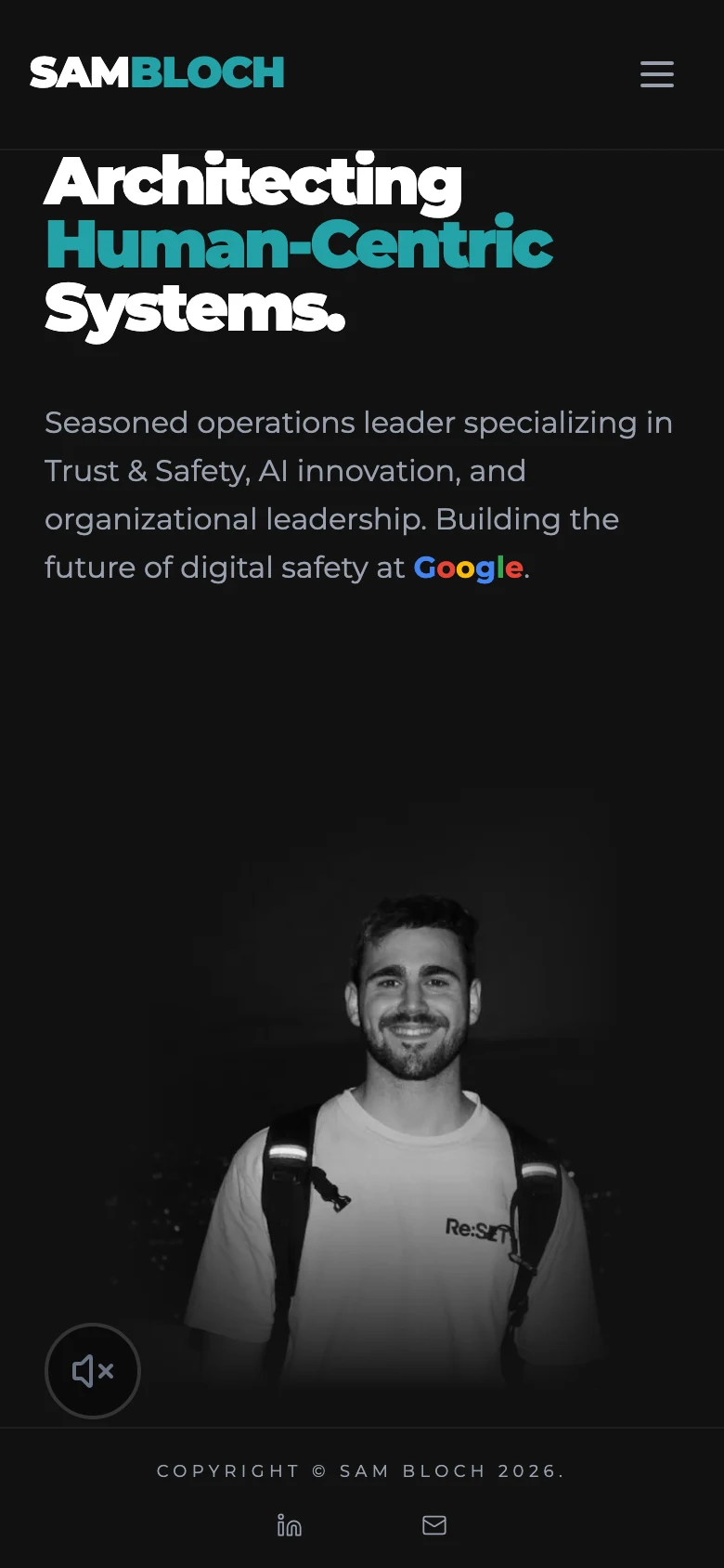
The whole thing runs from a single React app. A toggle flips between the two experiences — same content, same routes, different wrapper.
 LAYER 01
2D Editorial
The clean, scrollable version. Mobile visitors and lower-spec machines get this by default. Reads well, loads fast, doesn't ask your GPU for anything.
LAYER 023D Workstation
A Spline-powered room where you're at my desk. Orbit the camera, click objects — each one maps to a content theme. The guitar opens my About page.
Site Architecture
Two entry points, shared navigation, one content source. Here's how it all connects.
Interactive Site Map
Click to expandSpline, Meshy, React, ship.
The workflow bounced between spatial design in Spline, AI-generated 3D models from Meshy.ai, and stitching it all together in React. Lots of back and forth, lots of "wait, that doesn't look right."
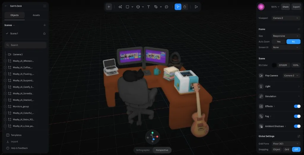
Every object placed, lit, and animated by hand. The monitors, desk, and guitar are all clickable — each one mapped to a content theme.
Drag to explore
Stack
Two experiences, one codebase, zero templates.
The new hero section — desktop view
Projects & Artifacts — the full archive
Mobile — responsive 2D experience
The resume page — clean, data-rich, and printable
Questions I got asked a lot.
Not every device can handle WebGL. Not every visitor wants it, either. The site checks what you're running and serves the right version. Mobile gets the editorial view. Desktop users can opt into the full 3D thing.
Both paths surface the same content — nobody misses anything regardless of which one they land on.
People remember "the site with the desk" more than "the site with the nice resume." It proves I can ship 3D, manage WebGL performance, and think spatially.
It also grows with me. New content is just a new desk object. No redesign required.
I wanted the portfolio to be the proof, not just the container. If I'm going to claim I think in systems, the site itself should demonstrate that. Templates are useful, but they tell a different story.
Every component, every animation, every layout call was mine.
Claude was basically my pair programmer — debugging weird CSS spec behavior, iterating on scroll animations, tuning ambient particles across probably 14 rounds of back and forth. We went deep.
Meshy.ai generated the 3D assets for the Spline scene. AI made me faster. The creative calls were still mine.
Like what you see?
I'm always open to discussing new opportunities, creative projects, or just nerding out about design and technology.
Built with React 19 · TypeScript · Tailwind v4 · Spline · Claude AI
View open source repository →